Thursday, May 6, 2010

ATTRACTIVE AND REPULSIVE PHOTOGRAPHS


This Photograph is repulsive because flowers are ususally beautiful and when someone receives a flower it's looked at as cute or romantic but if the flower is dead and wilting then it's rude and mean. So by the flower being dead it's repulsive instead of attractive.
This photograph is repulsive because the world is so beautiful but when it's cluttered up with garbage that people just throw on the streets then it makes it look dirty instead of beautiful.
This photograph is attractive because at first it looks like just a pile of rusted and dirty garbage piled in someones line but then when you notice the bright colors and the contrast with the red and green it looks attractive and not like a bunch of garbage anymore.

Friday, April 30, 2010

Filter 4


For these 2 photos I used the Gaussian blur but then I changed the layer's opacity to 50 so that it wasn't as noticeable it just added a softer texture.

Filter 3


I used the neon glow for this photo and gave it a 18 for brightness and a 2 for size.


This one I ended up using a 4 for size.

Filter 2


I used the gaussian blur on both of these photos to make them look more easy-going and not so cut and dry. It also really brought out the color in my photos.

Filter 1


At first I used the dark brush stroke for this one of my dog Benjamin, but since the background doesn't have much in it I couldn't really see any difference so I then put the semi-e brush stroke over it to make him different than the background.


I duplicated the layer and then lassoed my cousin, Tessa, in the picture then i put a dark brush stroke filter onto the background so that she would pop. I figured this filter would be appropriate because my other cousin looks so happy and she isn't so I wanted to make her stand out more.

Friday, April 16, 2010

Tiny Planet Photograph


Space

1. Space and value are used to show atmospheric perspective. Space is shown by the smaller sizes of the mountains. Value is shown by the decrease in color as it goes backward; more detail is in the closest object.
2. Linear perspective is lines all pointing towards a certain direction to give the illusion of depth. One point perspective has only one vanishing point where two point perspectives has two vanishing points.
3. Nonlinear perspective, if it’s overlapping another object it’s closer to the viewer, if it’s higher up on the page its farther back therefore creating the illusion of depth and when it’s smaller in size it’s also farther back. These three all together create the sense of depth.
4. One point perspective is used to draw natural shapes rather than rectangular shapes.
5.
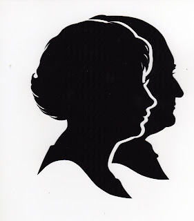


The woman’s head is more viewable where the guys head is cut off, this shows an overlap.


The tree is more detailed where as the mountains in the background are blurry and just show values, not the tiny details. This shows atmospheric perspective.


The lines from the two walls, the ceiling and the floor tiles all are directed to one place which is that back wall, this is linear perspective.


The bowling balls closer to the viewer are bigger than the ones that are farther away, the size changes to show depth and also show scale.


The trees being higher on the canvas than the road shows position because since the trees are higher on the picture plane it shows that they are farther back than the road which is closer to the viewer.